Tuesday, September 29, 2009

La Fabril "Magazine"

La Fabril launched the new product Olympia the only disinfectant floor cleaner with insect repellent action. To highlight this benefit, developed through a traditional channel innovative and simple action. Who ever did not roll it up the magazine to kill the mosquito or cockroach on the wall? Based on this brand insight hired 4 magazines for free distribution: Interbarrios, Clubs, Samborondon & Country's for an interactive action. These magazines have a circulation of approximately 30,000 copies, comes monthly to gated communities, clubs, medical offices and restaurants and are delivered door to door every month. The reader received its monthly with the particularity of being rolled up and tied with a strip of paper. In the back of the strip close to the Olympia logo.

Agency: Maruri Grey Ecuador.

Monday, September 28, 2009

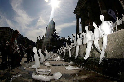
WWF Germany "Ice sculptures"

Ice sculptures in the shape of humans are placed on the steps of the music hall in Gendarmenmarkt public square in Berlin September 2, 2009. Hosted by the German World Wide Fund for Nature (WWF), 1,000 ice sculptures were positioned on the steps in the German capital at noon, to highlight climate change in the arctic region.

Artist: Nele Azevedo.


Sunday, September 27, 2009

Visine Dry Eye Relief "Ambient stencil"

On Wednesday 23rd September 2009, Sydney experienced one of its worse dust storms on record when winds of up to 100km/h shifted more than 75,000 tonnes of orange dust every hour from the Australian outback and then blanketed the city in a thick film of red. Unlike anything ever seen before by residents or weather experts, the dust storm provided a perfect tactical opportunity for Visine Dry Eye Relief. Using a saline solution, they stenciled the Visine logo onto dust-covered sidewalks, cars and shop-front windows around Sydney, highlighting the product's ability to soothe and refresh dry eyes.

Agency: JWT Sydney, Australia.

Friday, September 25, 2009

Rexona "Samples"

Rexona introduces its new fragrance inspired by delicate perfumes and with the support of outdoor advertising, invites woman attracted to the fragrance expelled by the poster to remove a sample and keep it. Each week, the slips of paper were replaced with new perfumed ones.

Agency: Lowe Ginkgo Montevideo, Uruguay.

Active Watch "Wallet"

An anti-consumerism campaign used as a tool to explain the connection between buying frenzy for unnecessary products and the degradation of the environment. The challenge was to make heavy shoppers aware that the more they buy unnecessary things, the more nature deteriorates through massive production, oil consumption, land clearings and the overall expansion of urban areas against nature and its resources. In order to create a buzz around this issue, they created pratical wallets, wich were distributed in front of malls and supermarkets. The wallet functions as a reminder for the consumers not to buy unnecessary products because they will contribute to the degradation of nature. Each of them had a print with nature scenery and a button depicting an animal. This way, every time one opened the wallet, the animal was deprived of their natural environment and left to die. They were offered to people leaving the malls and supermarkets with their shopping carts full of goods and were distributed together with a brochure containing maga-deals for heavy shoppers, from Supercharged cars to Residential areas built after land cleanings undertaken in the middle of a forest. The anti-consumerism wallets were part of a bigger campaign, along with radio commercials, brochures and a website.

Agency: Grey Bucharest, Romania.

Axe Day & Night "SMS"

To complete this ad send Axe to 2345 after 9pm New Axe Day & Night. One is suitable for general audiences. The other one is not.

Agency: Lowe Ginkgo Montevideo, Uruguay.

Thursday, September 24, 2009

Anurak Janmas "Private Detective"

There are many private detectives working in Thailand today. They are, however, anonymous and unknown to the general public. Their client considered himself to be in this category and tasked them with making him stand-out and be more memorable to potential customers. At first glance it looks just like any other name-card, but upon closer inspection, reflects the talent, dedication and experience that the detective has at his disposal when working on a case. Inquiries from potential customers tripled within the first month after the name-card was circulated.

Agency: Ogilvy & Mather Bangkok, Thailand.

La Charcuterie "Stationary"

Here’s a stationery package that was recently designed for a sandwich shop. La Charcuterie is a deli/restaurant hybrid well known around Vancouver for serving up sandwiches filled with deli meats. To play off this, business cards were created to look like cold cuts then were strung in netting similar to the way salami’s and other cured meats are hung in delis. Finally, they printed meat stickers for the letterhead and envelopes made of butcher paper— the same paper they wrap their sandwiches in.

Agency: Rethink Vancouver, Canada.

Agudol "Pain"

Agudol is a non prescription painkiller specially formulated for headache. For general confidence and gain ground in May to its competitors, is developing a piece of direct marketing aimed at clinicians who recommend the product to their patients. Through its own medical representatives, Agudol to him a small wooden box, inside was a racket toy with a rubber ball attached to it with an elastic thread. On one side was printed the face of a frowning man and the other the same face but relaxed. Grupo Farma del Ecuador S. A. received excellent feedback and compliments from doctors and health visitors who rated themselves action as the fun and seller.

Agency: Maruri Grey, Ecuador.

Audi "Garage Banner"

Following its Canadian releasy early this summer, the Audi R8 5.2 V10 sold out immediately. With fans clamoring to own of these groundbreaking vehicles, they pioneered an equally groundbreaking advertising solution - one that gives every person the chance to get an R* for their garage. Available at "Audi.ca", this 1:1 scale, photo realistic banner, conforms to garages and mirrors everything exept the vehicle's price.

Agency: Lowe Roche Toronto, Canada.

HBO Imagine "Cube"

The HBO Imagine campaign, an expression and embodiment of the HBO philosophy—to be the preeminent source of entertainment experiences that change perspectives, defy expectations and challenge the status quo—has officially launched. The multi-platform storytelling experience sets out to prove that there are many sides to every story and a change in perspective changes everything. The centerpiece of HBO Imagine is HBOimagine.com, an online universe that allows users to dive headfirst into an interactive story and game-like experience that deepens the more one explores it. There are over 41 pieces of content, including short- and long-form video, audio files, news stories, letters and images that are connected to each other, revealing more of the big picture with each click. Users can navigate the story by unlocking and viewing the content. HBO Imagine is also being realized in a multi-city outdoor installation called The Cube. The HBO Cube is a unique, new storytelling device that offers four different perspectives on the same scene simultaneously. In telling the same story from four distinct points of view, each side of the cube stands alone as an engaging film, and as one piece of a larger puzzle. As viewers move around the cube, they watch the story unfold from different perspectives, forming different perceptions, and often misperceptions, of the characters and plot. Only by watching the story unfold from multiple sides of the cube can one begin to see the bigger picture. The HBO Cube features two films, each 2 minutes and each played twice successively, on a rotating basis.

Agency: BBDO New York, The Barbarian Group, USA.

Kleenex "Soap dispenser"

Present in a amazing way the Kleenex Tissue as a good help for nasal congestion caused by flu. They placed interactive stickers on liquid soap bottles available in mall bathrooms and in toilets of public places.

Agency: Trampolim Comunicação João Pessoa, Brazil.

Movistar "Face Mask"

The idea was to take advantage of the worldwide heavy media news coverage on A-Flu in order to generate sympathy among people through a simple action in face of the social paranoia it produced. Within the context of this extremely contagious illness through direct respiratory system a Cell Phone Company proposed that in some crowded confined places it was better not to speak and that the best way of communication was trough SMS. In consequence, the campaign used one of the typical A-Flu objects shown by the media during this outbreak. At the entrance of the downtown subways in Buenos Aires, face masks with a message printed were distributed among passengers that would use them in their trips inside the subway. 1- "These days is better to use SMS" 2- "You'd rather use SMS"

Agency: Publicis Graffiti Buenos Aires, Argentina.

Wednesday, September 23, 2009

Romanian Traffic Police "Pissing test"

In Bucharest, the majority of the drunk drivers are men. Most of them drive under the influence after drinking alcohol in pubs, bars or clubs. The main dilemma was how to get these guys with a very low budget. Because it's nearly impossible to drink while out without going to the toilet, the urinals in the men's bathroom were transformed in an active reminder of the reduced ability to drive when being drunk. The stickers are placed in the most crowded bars in the center of Bucharest, with a total estimated clients of 2000/day.

Agency: Mercury 360 Bucharest, Romania.

Pizza Hut "Bike Clock"

A large digital countdown clock was installed on the back of Pizza Hut delivery bikes to dramatize their on-time delivery promise. Passersby bear witness as the riders literally beat the 30-minute time limit to their destination.

Agency: BBDO Guerrero/Proximity Makati City, The Philippines.

McDonald’s "Open 24 hrs"

As every restaurants have their closing hours. They feel that this is a great opportunity for McDonald’s to communicate the new 24 hours service. McDonald’s places a night image of its restaurant onto the pull-down shutter of various restaurants. Once the shutter is pulled down after the restaurant’s operating hours, passer bys will see an image of a McDonald’s in late hours. This is to deliver the message that while other restaurants are closed, one can enjoy good meal at McDonald’s 24 hours a day.

Agency: TBWA\ Bangkok, Thailand.

McDonald's "24-Hour Clock"

They have to find an innovative way to communicate to motorists that McDonald's is open 24 hours. They created a clock using McDonald's products as numbers to whet the appetite of motorists and drive home the idea that these treats are available anytime of the day. it was strategically placed in high-traffic area to entice consumers to visit their store. It was an effective hunger trigger! The clock helped generate increase in sales by 13,9% vs same period of last year.

Agency: DDB, The Philippines.

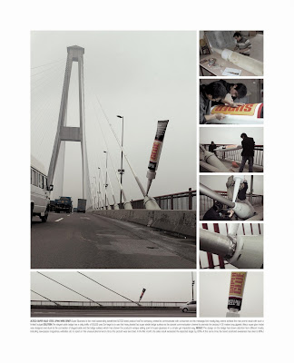
Alteco Super Glue "Steel Span Wire"

The communication is focusing on “Alteco Super Glue”, aims to make the brand grow up rapidly in China market. The power of Super Glue to secure the suspending cables supporting the suspension bridge. The sales increased 120% more than the target number, what’s more, the brand recall and brand preference achieved at 96%.

Agency: DDB Shanghai, China.

Inspiration.

Gum Faces are sculptures in chewed gum made by the Portuguese colective Super Gorrila and spread around town.

Plaza Avenida Shopping "Plaza on ice"

Sticker by the elevator at the Plaza Avenida Shopping (Avenue Plaza Mall) at São José do Rio Preto, São Paulo, Brasil (one of the hottest towns in State, in summer temperature reaches near 40 degrees celcius and never snowed) in form of termometer to promote a temporary skating ring in the basement of the Mall.

Agency: Rede M., São José do Rio Preto/São Paulo, Brazil.

Dove "Real beauty"

As part of Dove's famous campaign for real beauty the put prepared weight sclaes in girls locker rooms of schools and public swimming pools. When in use they display a simple truth: real beauty can't be measured in kilos.

Agency: Ogilvy & Mather Düsseldorf, Germany.

Adidas Colombia "Gazelle fridge"

Adidas wanted to launch its new sportswear Gazelle with Cool Climate technology, that keeps the users fresh while running. This product was being launched in hot climate cities such as, Cartagena, Barranquilla and Bucaramanga (Colombia). In order to sell the benefit of this technology, the stores were equipped with refrigerators. Inside, laid the Cool Climate outfit (shoes, shirt and shorts). Once the user opened the refrigerator he/she obtained the outfit in a cool temperature. In addition to this, ventilators were situated below the clothes, a constant movement of the clothes supported the freshness concept. This strategy communicates that staying fresh while exercising is essential. The runners that took part of this experience are now Gazelle users. Therefore the Cool Climate sportswear is now seen as the ideal gear to exercise in hot climates.

Agency: Pull & Push Y&R, Bogotá, Colombia.

Tuesday, September 22, 2009

Bulldog Coffee "Bitchslap"

Bulldog Coffee is a boutique espresso bar revered by some for its bold, delicious coffees and despised by others for its even bolder and rather abrasive staff. This postcard captured the ‘Bulldog experience’ from both perspectives at once and was quickly snapped up by those in the know.

Agency: GJP Advertising Toronto, Canada.

Monday, September 21, 2009

Lenor "Flower buckets"

The challenge was to create awareness for Lenor flower - scented laundry softener. They replace the flower buckets of the Romanian florists with Lenor bottle-shaped buckets, emphasizing the flower fragrances of Lenor softener in a free of charge and powerful way. The flower buckets from most Romanian flower shops are neutral and kind of dull. The simple action of replacing them, offered the brand free media space with great exposure, highlighting the product benefit in a fresh way. The idea came to life in the flower shops across Magheru Avenue, one of the Bucharest's most circulated street; between 15,000-20,000 pedestrians per day. One an non-spot-qualitative research, in terms of creativity and distinctiveness, on a scale from 1-5 (5 being the maxium), 85% of the respondents rated the idea above 4.

Agency: Grey Bucharest, Romania.

Furniture showcase "Folding Shelf, Folding Table, Folding Chair"

Miniatures that fold out of the centre-fold, and fold back in when you close the magazine. “Lightweight Folding Shelf EEX5. Fits under your bed too.”

Agency: Grey Group Hochiminh City, Vietnam.


Immersion Creative "Return to sender"

A two-page, full-colour spread in Canpages (or the Yellow Pages) can cost up to 80,000 dollar per year. However, these days, most people search online for the very same services. Immersion Creative sent a letter to everyone with a two-pages, full color ad, in an envelope made out the very ad they use. Included was a screen capture of their current Google ranking, and an offer to make it even better - for half the price.

Agency: Immersion Creative, Canada.

Friday, September 18, 2009

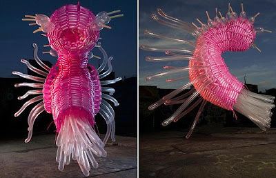
Inspiration.

Jason Hackenwerth takes balloon sculptures to a whole new level.

Check his work here:
Jason Hackenwerth

Fiat 500 C "Tree Planters"

From August 5 to September 30, the cutely nostalgic Fiat 500 C, unveiled in February, appears on Milan’s world-famous fashion street, Montenapoleone, in an unexpected role. Exactly 20 fiberglass replicas, precisely the same size and shape as the little Fiat, have become planters for real trees of various shapes. The happening, called “Per fare un albero” (Create a tree), is a cooperative effort between the City of Milan, Fiat, and artist-designer Fabio Novembre. In Novembre’s words, his solution to merge into one object trees and cars, two elements always vying for urban space, is a “symbol of a new way of living.” According to Fiat’s spokespeople, Fiat 500 C’s cheerful, friendly, innovative and eco-friendly character is a perfect fit for such an undertaking. - Tuija Seipell.

Artist-Designer: Fabio Novembre, Italy.


Wednesday, September 16, 2009

McDonald’s "Free coffee ambient"

As part of a national campaign promoting McDonald's restaurants, a downtown Vancouver lamppost became part of an out-of-home optical illusion, appearing to pour coffee into a giant cup on the sidewalk. At the time, McDonald's was giving away free small cups of its brew for a two-week period, in an effort to attract new breakfast customers. They developed the concept for a lamppost near 6th Avenue and Cambie Street. The post was wrapped in brown vinyl to resemble poured coffee, while an oversized carafe was attached to the end.

Agency: Cossette West, Canada.

Koji Sueyoshi "Mixtape Generation Card"

A mixtape Generation Card from Koji Sueyoshi.

Designer: Koji Sueyoshi.


Ministry of Health Brazil "Sexometer"

They create an urban outdoor, placed in Brasilia, capital of Brazil, to promote condom's use. The idea was to surprise people with a funny and interactive sex thermometer: The "Sexometer". The measuring is very simple. People just have to place their hands at a heat sensor, wich will change color according to body temperature. At the bottom of the outdoor, there is an explanation for each color. If the sensor doesn't change colors, it means your body is still just warm. If it turns blue, it means your body is heating up. Green means you are in the mood for sex. Red means you are on fire and ready to get going. Obviously, all messages led to the same conclusion: use a condom. Thirteen thousand condoms were given at the event.

Agency: Master São Paulo, Brazil.

Tuesday, September 15, 2009

Inspiration.

These milk crate men have been appearing on the streets of Melbourne since 2006.


Discount Bank "Global warming off"

Discount Bank, declared itself as becoming a "Green Bank", as a part of the process they were asked to create an internal campaign addressed to the employees. But, to differentiate itself from a "usual" campaign which in many cases is immediately forgotten once it gets off the air, the mission was to educate the employees to permanent environmental awareness which will last and eventually create a real difference in their consciousness beyond their work hours. A simple sticker in the size of a light switch on its upper side is written the word: "ON", lower- "Off" and in the middle- "GLOBAL WARMING". You paste the sticker on the light switch and... that's about it! Within just one day, "Discount Bank" tower became a green tower. Every single employee is exposed daily to the strong connection between electricity consumption and global warming and can, with his small finger, contribute to the global effort.

Agency: TBWA\YEHOSHUA, Israel.

Saturday, September 12, 2009

Oxygen Network "Dance Your A** Off"

Oxygen Network, along with Dom Camera and Company, partnered with Monster Media to create a cutting edge ad campaign promoting the premiere of their new reality show, "Dance Your A** Off". This technologically infused storefront domination campaign stopped thousands of pedestrians in their tracks at its highly trafficked location just steps away from Macy's in NYC. The (9) LCD linked high definition display featured dance clips from the new show that were triggered by the body movements of passers-by. Keeping with Oxygen's "Live Out Loud" theme, users not only triggered the interactive display but also activated an audio aspect, complete with the show's theme song and a voiceover from the show's host, Marissa Jaret Winokur. Oxygen's customized Monster Storefront was an automatic attention grabber. The campaign not only increased viewer awareness of the show's premiere, but also lead to "Dance Your A** Off" setting a network record when it debuted to an average of 1.3 million total viewers. That's the largest audience ever for an Oxygen series premiere!

Agency: Dom Camera & Company New York, USA.

Friday, September 11, 2009

Comision Especial de Discapacidad "Miracle"

We ask for respect, not miracles. Comision Especial de Discapacidad.

Check the video here:
Miracle

Agency: Pragma DDB Lima, Peru.

Vodafone "Go Tag"

A stunt for Vodafone to celebrate the launching of HTC Magic. The project, baptized Go Tag, consisted in a sort of catching-game in which the teams had to take pictures of Vodafone's symbols in the opponent's t-shirts.

Check the video here:
Go Tag

Agency: Marvellous Amsterdam, The Netherlands.

Thursday, September 10, 2009

Coral "Light Bulbs"

Coral, with the objective of promoting its premium decoration line, distributed colored light bulbs which when lit and pointed towards a white wall revealed how much a different color can make environments better looking. 200 lights in total were produced and delivered to consumers who can now experiment with other colores in their house in a simple and fun manner. Then it's just paint with the corresponding Coral paint.

Agency: Leo Burnett Brasil São Paulo, Brazil.

Wednesday, September 09, 2009

Latet Charity Organization "Urban Protest Exhibit"

An Urban Protest Exhibit featuring 1.3 kilometers of dinner tables. All the tables are empty: empty plates with forks and knives, to demonstrate the need for 200,000 holiday meals. The billboard carries a single message: "Give 200,000 holiday meals. Donate a holiday meal by sms to 2255 or go online www.latet.co.il" that distributes food pac. Latet (in Hewbrew "to give") is an organization that distributes food packages to Israelis too poor to afford basic food baskets and especialy a holiday meal.

Agency: Shalmor Avnon Amichay/Y&R Interactive Tel Aviv, Israel.


Tuesday, September 08, 2009

Vodafone Phone Insurance "Well-meant Thieves"

In Romania a phone is stolen every two minutes. People know that phones are being stolen, but the don't believe that it can happen to them. So, they don't take into consideration insuring their phones. The hired professional pickpockets to slip the flyers promoting the Vodafone Insurance into peoples bags, purses, pockets or any other place they keep their phones. This way they proved them how vulnerable they are and made them consider very strongly insuring their phones.

Agency: McCann Erickson, Romania.

Greenline Gym "Threadmill"

To promote a well-being center, a communication activity was developed with the aim of establishing a presence in one of the places where people make key lifestyle decisions: the supermarket. The creativity was based on the idea of turning a check-out conveyor belt (feeding your food to the operator) into a treadmill (the classic calorie burner).

Agency: JWT Milan, Italy.

Monday, September 07, 2009

Parkinson’s Victoria "Skill Tester"

The slowness, rigidness and shaking limbs often associated with Parkinson’s Disease can make simple, everyday tasks virtually impossible. For non-sufferers it’s difficult to comprehend an existence where opening a carton of milk or using a telephone is an impossible task. They helped people experience this complete lack of physical control for themselves by filling arcade style skill-testers with everyday objects. They then placed them around Melbourne, collecting $1 coins to fund help Parkinson’s Victoria’s research at the same time. In the first 12 hours over $5000 was collected.

Agency: DDB/Rapp Melbourne, Australia.

Lava Soap "Grimey Hand Society

A mailer was created, encouraging craft-store buyers to stock Lava Soap in their stores. Instead of sending heavy-handed testimonials, they developed the Grimey Hand Society—a group of people who love dirty hands and want to keep Lava Soap from being distributed. The mailer is complete with pictures, notes and letters that demonstrate this group’s disdain for Lava Soap and its hand-cleaning cleaning effectiveness.

Agency: O'Leary and Partners Newport Beach, CA USA.

Folliderm "Bald man"

The task was to increase Folliderm prescriptions - a brand that prevents hair loss by strengthening hair roots. Hair fall is an extremely common condition, but seldom referred to a doctor. They had to tap this potential. The use of brand name was not permitted. The use of the brand name was not permitted. So they used a surrogate brand name based on its unique formulation: Power of 1+4. They used elevators in corporate offices and residential buildingss to deliver the message. A face of an man was stuck on the elevator door. Such that his hair was stuck on one door and the rest of his face on the other. When the door opened, the hair pulled away. Another print was stuck in the inside of the elevator - where the man was shown bald. The line read: "Scared of losing your hair? Ask your doctor about Power 1+4". It was highly amusing for people - and the centre of conversation in the elavators. More importantly there was a significant rise in enquiries about the therapy among doctors in adjoining localities (where the creative was placed).

Agency: Sorento Healthcare Communications Mumbai, India.

Thursday, September 03, 2009

DHL "Turning Page"

Innovation uses magazine particular media form which means a piece of transparent PVC paper will be placed into a magazine and will be printed a DHL worker on both side, Therefore, when you turning the paper the worker can deliver the express mail to no matter Chinese or Japanese customers. By doing this, the fast and reliable international express mail service can be embodied.

Agency: Shanghai J&J Advertising Co., Ltd. China.